💧 Exercises

28/08/19 - 11/09/19 (Week 1 - Week 4)
Ng Mei Ying (0340563)
Typography
Exercises
LECTURER NOTES
Lecture 1: Briefing & Introduction to Typography
28/08/19 (Week 1)
During the first class, Mr Vinod and Mr Shamsul were introduced to be our lecturers. They guided us on how to create a blog as an e-portfolio step by step by using a new Gmail. They explained the details and the format that we should follow to create a clean yet well-organized blog along with with the example blog from our senior. Mr Vinod continued giving us a clear briefing about the course module and the breakdown of future assignments. He started the first lecture after giving us a small break. The lecture was about the definition of Typography together with the main 3 Typography terminologies.
Definition of Typography: The style & appearance of printed matter.
Important terminology in Typography:
- Font: The process of creating & designing an individual typeface.
- Typeface: The individual type or weight within the typeface.
- Type Family: Entire family of fonts that share similar characteristics.
After having a lunch break, Mr Vinod gave us the first exercise after showing some example from the senior's blog. We need to choose one personality of yours and come out with 5 ideas of lettering to support the characteristic of the personality. Before dismissal, he informed us to bring graph papers and laptop for our next class with the following Adobe software downloaded: Photoshop, Illustrator, InDesign and FontLabStudio 5.5.
Lecture 2: History & Development of Typography
04/09/19 (Week 2)
We are introduced to the Early letterform development from Phoenician to Roman. Phoenician created the early letterforms which were scratching into wet clay with a sharpened stick or carving into stone with a chisel. Uppercase letterforms are the one and only letterform during that time.
 |
| Fig 1.0 The development of the font |
The Greeks changed the direction of writing and developed a style of writing called ‘boustrophedon’ (how the ox ploughs), which meant that the lines of text read alternately from right to left and left to right. The orientation of the letterforms had changed too.
 |
| Fig 1.1 The ‘boustrophedon’ |
Square capitals were the written version that can be found in Roman monuments. Soon a compressed version of square capitals evolved which allowing for twice as many words on a sheet of parchment and took far less time to write but they were slightly harder to read due to their compressed nature.
 |
| Fig 1.2 The Square Capitals |
 |
| Fig 1.3 The "compress version of square capitals" Rustic Capitals |
Charlemagne, the first unifier of Europe had created a new hand script that standardized all the text throughout Europe. With the dissolution of Charlemagne’s empire, a condense strongly vertical letterform know as Blackletter or textura gained popularity.
Gutenberg’s then introduced the new text printing technique which marshalled text to build pages that accurately mimicked the work of the scribe’s hand. His type mould required a different brass matrix, or negative impression, for each letterform.
 |
| Fig 1.4 The Gutenberg Bible. |
Lecture 3: Type Application
11/09/19 (Week 3)
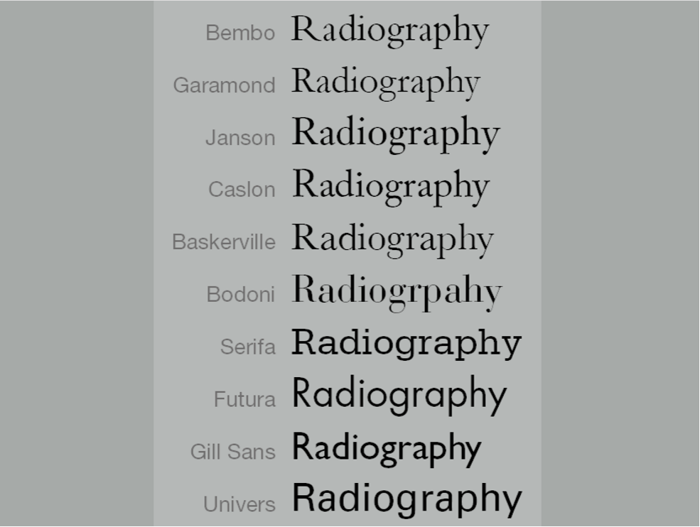
This week Mr Vinod taught us about the basic type application. Loose tracking and tight tracking is not suitable for long reading. He gave us some examples of several passages with different type family applied to investigate the variations among the text. Text readability of word depends on counter form. Science proof that we read through designed patterns.
 |
| Fig 1.5 The letter kerning |
- Kerning: automatic adjustment of space between letters.
- Letterspacing: adding space between the letters.
- Tracking: addition and removal of space in a word.
- Flush left: each line starts at the same point but ends at the last word on the line ends.
- Centered: impose symmetry upon the text. Only suitable for short quotes.
- Flush right: emphasis on the end of a line as opposed to its start. Use it less.
- Justified: archive by expanding & reducing space between words. The opening space formed called "rivers"
 |
| Fig 1.6 Typography Anatomy |
- X Height: space between text height and the baseline.
- Type Size: The size of the font.
- Leading: The space between 2 lines (ascender line & descender line) of text.
- Line Length: The width of a block of typeset text.
Mr. Vinod said that a good typographer has to know which typeface best suits the message at hand. Besides, we have to learn how to feel the text. We have to able to detect the feelings of the text. During the process of design, we have to understand the principle of balance to ensure that we are able to measure how much is too much and how much is needed. A good rule of thumb is to keep the line length between 55 - 65 characters. The size of the font shall be large enough to read easily at arms length.
 |
| Fig 1.7 Typography Anatomy 2 |
 |
| Fig 1.8 Diagram of Serif & Sans Serif |
 |
| Fig 1.9 Diagram of Serif & Sans Serif |
INSTRUCTIONS
Exercise 1: Personality Letter Design
28/08/19 (Week 1)
The first exercise was given: Choose one personality of yours and come out with 5 ideas of lettering to support the characteristic of the personality. I came out 2 potential personalities describe me the best which were artistic and joyful. I realized that there are huge possibilities to create a font design with the personality of Artistic, so I decided to combine the personality characteristic which was to create an artistic yet joyful font design. I started to do some research on Pinterest to get some ideas for the font design that suits my personality.
 |
| fig. 2.0.1 Five sketches ideas for the personality of "Artistic". |
For the font 1 until font 4, I tried to design the font using some simple and clean geometry shape like circles, semi-circles, rectangle, triangle and so on to bring out the artistic sense in a minimalist way. I made them somehow a little like an origami, blocks and lego art. For font 5, I tried to combine the lively element from the animals and the plant for the font design. The last font design was an extra design by using simple, clean and curvy lines. Finally, I decided to pick the font design no.2 which seems like origami art as I thought it will describe the personality in a good way.
Exercise 2: Lettering
04/09/19 (Week 2)
For our second exercise, lecturers taught us some simple and basic techniques on how to create a GIF for the font design by using Adobe Photoshop and Illustrator. I then start to do drafting in Abobe Illustrator. I decided to apply the idea of “origami art” to the font design by creating a paper folding effect. After finishing the drafting in Illustrator, I start to animate it in Photoshop to see how was the effect of animation.
 |
| Fig. 2.1.0 Artistic; The selected font design. |
 |
| Fig. 2.1.1 Artistic; Screenshot of artboards in AI |
 |
| Fig. 2.1.2 Artistic; The thumbnails of process |
| Fig. 2.1.3 Artistic; The PDF |
 |
| Fig. 2.1.4 Artistic; The Final GIF Animation |
Exercise 3: Type Expression
11/09/19 (Week 3)
Lecturers had given us this new exercise last week, Type Expression. We were given 6 words to do the exercise of type expressions by using the specific type family provided by the lecturer. We had to identify the meanings of the words and pick a suitable font to express the meaning of the words. After that, sketch out the ideas on the A4 paper and start to draft it in AI without distorting the letters.
Below are the given 6 words :
- SNEEZE
- CLEAN
- PARTY
- GIGANTIC
- EXPLODE
- EMERGE
Mr. Vinod said that I shouldn't rely too much on the extra element to express the word of expression for the word "Explode". In the beginning, it was quite hard to express the word without distorting the font. I did some research by watching some youtube videos to get some ideas and knowledge on how the designer designs a good type of expression.
At the same time, I wanted to create a balanced visual design effect for each of the words so that all the types of expression design looked equal and harmony. After finished the still image type expression design, I picked the word "emerge" to continue the animation GIF-making as I think this word will show a rich layer of animation effect.
 |
| Fig. 2.2.0 Sketches for the type expression design |
 |
| Fig. 2.2.1 Type Expression Design |
| Fig. 2.2.2 Type Expression Design PDF |
Below was the animation Gif design for the word "emerge". I started the Gif with several layers showing the emerging of a spot, it then slowly fade away. Soon, I made each of the font of the word "emerge" slowly showing up from the big spot irregularly. Last but not least, I added some floating effect as an ending for the Gif. During the critique session, Mr Vinod said that my Gif looked more like describing the word "floating" instead of "emerge" as too much floating effect was applied on the Gif.
 |
| Fig. 2.2.3 Still Image of "Emerge" |
 |
| Fig. 2.2.4 Process of Animation GIF Making |
 |
| Fig. 2.2.5 Animation GIF of "Emerge" |
Hence, I decided to create the second version of the Gif. This time I made it more simple and focus more on the expression of "emerge". I still wanted to add the floating effect but this time I had deducted the floating effect comparing to the previous version.
 |
| Fig. 2.2.6 The Final GIF Version of "Emerge" |
FEEDBACK
28/08/19 (Week 1):
No feedback is given for the first class.
04/09/19 (Week 2):
I wanted to combine the characteristic of "Artistic and Joyful" but after showing my idea to both lecturers, they recommended me to chose one of the personalities as they were a totally different personality. Finally, I decided to chose "Artistic" as my personality and I wanted to show this personality by using the idea of "Origami Art" to the font design which will create a paper folding effect. Both lecturers said that was a good idea and I could straight forward to start the font animating.
11/09/19 (Week 3):
Mr Vinod mentioned that the final outcome of my name GIF looked great and nice. I was very satisfied and happy with my final outcome too as I managed to create an origami paper folding effect to express my personality of artistic successfully.
18/09/19 (Week 4):
Mr Vinod said that my GIF for the word “emerge” looked more like a concept of “floating”, he said that I had chosen a really good and nice word for “emerge”, he suggested me that I should make it more simple and straight forward by creating a GIF without the floating effect but making the word appearing from blur to clear. He also added that after choosing the right word, what we need to do was to enhance the effect but not putting too much effort to make it too complicated.
REFLECTION
Experience:
Week 1; The atmosphere for the first class was quite good. During the self-introduction session, I had a better understanding of my classmates. Besides, I found myself quite nervous in the first class as everything was unfamiliar for me and I need some time to adapt to the new educational environment. Week 2; It was a good starting when I tried to draft out the font design in Adobe Illustrator although I was not really familiar with Adobe Illustrator as I seldom used this software for my previous work. Week 3; During this week, there are two new students in my class. They came from Indonesia and Thailand respectively. Mr Vinod asked me to give them a helping hand on helping them to keep up with the course. I'm happy to assist them to ensure that they could follow the class soon. Besides, I was lack of time to finish all the 6 words expression drafting in AI in the class. Week 4; This class was quite challenging for me as I had to learn new software that I had never use it before which was Adobe InDesign. Besides, it was a little quite difficult for me to follow the lecturer as there were lots of strange professional vocabularies for Typography and I really need time to digest the whole lecture by doing revision and extra research. The way Mr Vinod gave the lecturer was too fast for me to digest as the time was tight and my English listening was not good enough. (I think)
Observation:
Week 1; I found that most of the students did not have a clear idea of how to create a good e-portfolio and font design at the beginning. Thanks to the great e-portfolio example given by our lecturers, I'm able to get some rough ideas on how to create a nice blog and to design the font. Week 2; I found that Adobe Illustrator and Adobe Photoshop are great for font design too. The process of learning adobe Illustrator was not that difficult and complicated as I imagined. The learning process will become easier when you try to ask for help from lecturers and peers. Week 3; I realized that everyone seemed to have a similar idea on the expression of the words but what very inspired me was they were able to create something different to express their own idea in different kinds of ways. Week 4; Mr Vinod told all students to leave their laptops on an open page of their blog for the 6 text expression design and GIF animation, He then wanted us to walk around to take a look at the other artwork get some ideas and inspiration. I observed that most of the students were using a similar but yet different way to express their design. Some of them were seemed to spend a lot of "sleepless nights" to create such painstakingly amazing Gif animation.
Findings:
Week 1; I found that it was a little difficult to follow the class at the beginning as there was a lot of information given by our lecturer during the first class. Therefore, cultivating a good habit of taking notes and asking a question is crucial for us to keep up with the class. Week 2; Lecturers told us we should be an active learner by doing further research about the topic that we had learned today which was the history of typography and the principle of "form follow function". Moreover, we were encouraged to fully use the materials provided by the university library to gain extra knowledge. We had to learn the rules, master it and break the rules. Week 3; I found that it was quite challenging to express the expression of the words in an appropriate way at the same time I had to choose one of the best from them to make an animated GIF. Week 4; I found that it was really important for us to master English well, at least we had to master some advanced English speaking and listening skill to ensure that we could follow up and digest the whole learning information. Quick understanding and note-taking abilities were crucial for a degree learner.
FURTHER READING
Lettering & Type by Willen and Strals
Week 1 - Week 3 (28/08/19 - 11/09/19)
 |
| fig. 6.0: Lettering & Type |
Week 1 (28/08/19)
- Letters are the throbbing heart of visual communication. For all the talk of the death of print and the dominance of the image, written words remain the engine of information exchange. Text is everywhere. It is a medium and a message. Its a noun and a verb.
- Letters and the words that they form are home for language and ideas. Like buildings, letterforms reflect the climate and the culture environment for which they are designed while adopting the personality of their content and designers.
- Although letters are inherently functional, their appearance can evoke a surprisingly wide range of emotions and associations, crudeness, and beyond.
- Legibility is what makes letterforms recognizable and gives an alphabet letter the ability and power to speak through its shape.
- Any lettering or type is based on a system. Like a moral code for the alphabet, typographic systems are sets of visual rules and guidelines that govern the actions and decisions involved in creating letters.
Week 3 (11/09/19)
Interview: Nancy Harris Rouemy
As a designer and art director at the New York Times Magazine, she is responsible for many of the publication's memorable lettering and type treatments. Whether creating her own lettering or collaborating with a commissioned artist, she complements the magazine's distinctive photography and illustration with equally compelling typography.
The reason for customizing type in an editorial setting:
- Custom type is used to create a brand for theme issues.
- To push an idea for the Typography with an arresting type solution.
- Type transmits a message that the photography/classical illustration cannot.
- Lettering can convey layers of ideas that compel the leader to decode & interpret.
The editorial strength & weakness of using lettering/type as a main visual element:
- As we were more and more entrenched in our computer era, lettering offers an infusion of freshness and surprise.
- There's a soulfulness, a humanistic quality that connects the reader to lettering.
- Specialize type solutions have to be in a judicious manner to affect the wow factor.
- The balance between photography, illustration, the magazine's fonts, and manipulated type treatments sustains visual pleasure.
The method to make the type and image related to each other as well as the article:
- Firstly, read the story first to get the design inspiration to approach for the solution of then tone, the type, or graphic elements.
- Typographic pages facing photography or illustration must be related and playoffs of each other.
- Scale, structure, fonts, colour, contrast, white space, alignments will constantly vary depending on the specific image at hand.
The most important things to consider when creating custom letters:
- Legibility and originality.
- It's the deviated form that draws attention and produces something memorable.
Typographic Design: Form and Communication (E-book)
By Rob Carter
Week 4 (18/09/19)
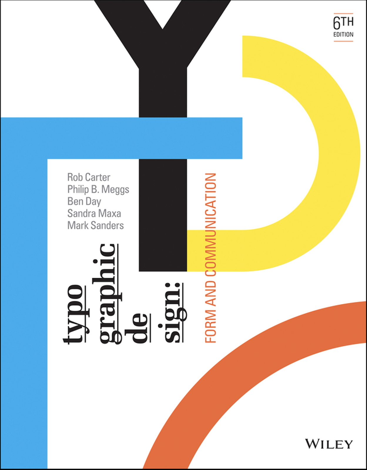 |
Fig 5.0 The E-Book cover
|
What I had learned?
- Designers most often rely upon an innate sense of proportion.
- It is helpful also to consider traditional familiar models which are the golden section
- First developed by Vitruvius, the golden section is basically a relationship or ratio between two numbers (or objects) wherein the ratio of the smaller number to the larger number is the same as the sum of both numbers.
 |
Fig 5.1 The Golden Section of Basic Square
|
A natural division of the golden section is the basic square. This archetypal form has influenced the development of the modern grid perhaps more than any other system of proportion. Squares in combination lend an infinite variety of visual patterns. In Japan, for example, the tatami mat, a straw floor covering based on double square modules, is a system for creating asymmetrical spaces in traditional Japanese homes.
.jpg)


Comments
Post a Comment