💧 Project 2

Ng Mei Ying (0340563)
Typography
Project 2
LECTURER NOTES
Lecture 5: Basic / describing the letterforms09/10/19 (Week 7)
This week, the lecturer was all about identifying the specific typeface and to have a better understanding of the specific component of the letterform through dissection. My lecturer said mentioned about this lecture should be given at the beginning of the class. Hence, this lecture was delay until now to ensure that we could remember and applied the knowledge immediately for project 2.
 |
| Fig 1.0 Diagram of typography basic. |
- Baseline: The imaginary line the visual base of the letterforms.
- Median: The imaginary line defining the x-height of letterforms.
- X-Height: The height in any typeface of the lowercase ‘x’.
Mr. Vinod said that a lot of us don't know that the reason to have an ascender height (for lowercase letter h) that exceeded the cap-height in an inconspicuous way. It was due to the reason that some of the letters (Like uppercase letter M) may have a bigger text size which took up more space on the top which will cause the letter "h" looked smaller and shorter. Hence, the ascender height was added to create an optical illusion of balance.
 |
| Fig 1.1 Diagram of typography anatomy. |
- Stroke: Any line that defines the basic letterform
- Apex (above)/Vertex (below): The point created by joining two diagonal stems.
- Arm: Short strokes off the stem of the letterform, either horizontal/inclined upward.
- Ascender: Portion of the stem of a lowercase letterform that projects above the median.
- Barb: The half-serif finish on some curved stroke.
- Beak: The half-serif finish on some horizontal arms.
- Bowl: The rounded form that describes a counter, may be either open/closed.
- Bracket: The transition between the serif and the stem.
- Crossbar: The horizontal stroke in a letterform that joins two stems together.
- Cross stroke: The horizontal stroke in a letterform that joins two stems together.
- Crotch: The interior space where two strokes meet.
- Descender: Portion of the stem of a lowercase letterform that projects below the baseline.
- Ear: The stroke extending out from the main stem or body of the letterform.
- Finial: The rounded non-serif terminal to a stroke.
- Leg: Short stroke off the stem of the letterform.
- Link: The stroke that connects the bowl and the loop of a lowercase G.
- Loop: In some typefaces, the bowl created in the descender of the lowercase G.
- Shoulder: The curved stroke that is not part of a bowl.
- Spine: The curved stem of the S.
- Spur: The extension the articulates the junction of the curved and rectilinear stroke.
- Stem: The significant vertical or oblique stroke.
- Stress: The orientation of the letterform, indicated by the thin stroke in round forms.
- Tail: The curved diagonal stroke at the finish of certain letterforms.
- Terminal: The self-contained finish of a stroke without a serif. This is something of a catch-all term.
 |
| Fig 1.2 Example of ligature. |
- Ligature: The character formed by the combination of two or more letterforms.
 |
| Fig 1.3 Example of swash. |
- Swash: The flourish that extends the stroke of the letterform.
 |
| Fig 1.4 Example of Em/En. |
- Em/En: Originally referring to the width of an uppercase M, and em is now the distance equal to the size of the typeface (an em in 48 points, for example). An en is half the size of an em. Most often used to describe em/en spaces and em/en dashes.
3 Types of dashes:
- Hyphen ( - ) : Use for words break/ words joint. (ex: up-to-date)
- En ( – ) : Replace the word "to". (ex: 1997 – 2019)
- Em ( — ) : Connect two sentences. (ex: He is afraid of two things—spiders and senior prom.)
 |
| Fig 1.5 Example of the different typeface. |
 |
| Fig 1.6 Example of the 9 typefaces given by the lecturer. |
The 9 typefaces mentioned below Fig1.6 represent 500 years of type design. People who rendered them all sought to achieve two goals: easy readability and appropriate expression of contemporary esthetics. As a beginning typographer, we should study these 9 faces carefully. Once we understand how to use these faces appropriately and effectively, you’ll be well prepared to understand and appreciate other typefaces as you encounter them.
Lecture 6: letters / Understanding letterforms
16/10/19 (Week 8)
This week, we learn about the design of the letter and letterforms. We have an understanding of how is the letterform is designed base on the difference in the size, weight, thickness and so on base on specific typeface and component. We will start and able to analyze and evaluate on the letter wherever we encounter them which is a good thing as it proves that we are starting to focus on observing the design of letter in our daily life.
The Stroke Weight
Below is the uppercase letterforms of Serif that suggest symmetry, but in fact, it is not symmetrical at all. We could easily discover that the difference in the stroke weights of the Baskerville stroke form (Fig 1.7). For the Sans Serif font (Fig 1.8), it may always appear symmetrical style but if we examine deeper, we will realise there were some differences in the thickness of the stroke ----- was not parallel at all.
 |
| Fig 1.7 Serif letter that introduce the differences in the thickness of the stroke and the size of the arc. |
 |
| Fig 1.8 Sans Serif letter that introduces the differences in the thickness of the stroke which is not parallel. |
The Curved Strokes
The Counter Form
(Fig 1.9) The x-height was generally describing the size of the lowercase letterforms. However, we should keep in mind that curved strokes, such as in "s, a, o, r", must rise above the median (or sink below the baseline) in order to appear to be the same size as the vertical and horizontal strokes they adjoin.
 |
| Fig 1.9 curved strokes must rise above the median (or sink below the baseline) in order to appear to be the same size as the vertical and horizontal strokes they adjoin. |
The Counter Form
specific letterforms are developing a sensitivity to the counterform (or counter)—the space describes. The counterform includes the spaces between them when letters are joined to form words. How well you handle the counters when you set type determines how well words hang together—in other words, how easily we can read what’s been set. The is a scientific proof that we are actually reading the pattern/negative space but not the letters!
 |
| Fig 1.10 The negative space forms by the counter space of the letter. It's crucial to provide a good feeling of balance in the form and the counter. |
 |
| Fig 1.11 The basic principles of Graphic Design apply directly to typography. The following are some examples of contrast—the most powerful dynamic in design—as applied to type, based on a format devised by Rudi Ruegg. |
INSTRUCTION
Project 2: Font Design
09/10/19 (Week 7)
During this week, Mr Vinod introduced us the project 2 which is about text formatting and expression. Before we start the project 2, we shall pick one of our favourite font designs out of the 9 typefaces given by the lecturer to study and analyze the letter typeface through dissection and deconstruction by using AI. Therefore, Futura Std Medium Regular is chosen for the letter typeface analysis.
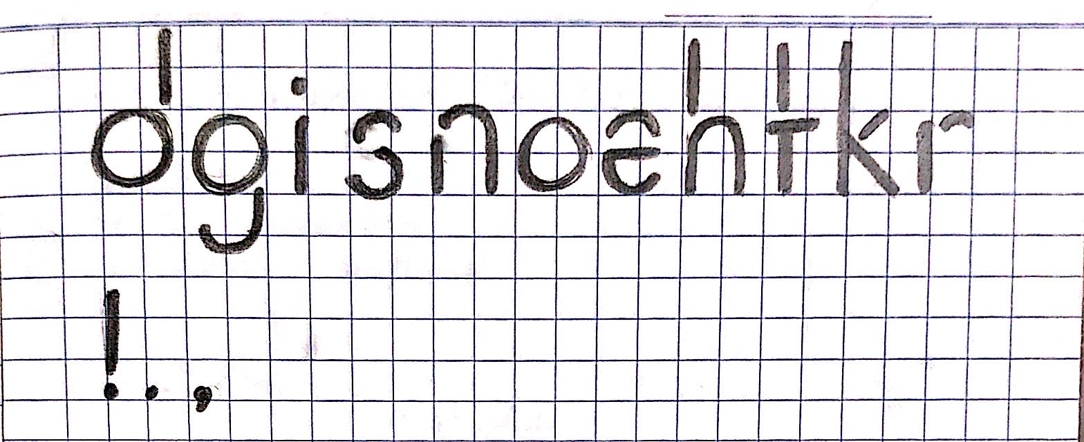
The Letter Dissection( d g i s n o e h t k r ! . , ) these letters and symbols are given by the lecturer as content for Project 2. We have to choose 4 out of the rest to do the dissection and deconstruction by drawing the gridline to figure out how did the typographer design the font. The image as shown below are the completed letters dissection.
 |
| Fig 2.0 Dissection of the letter "d". |
 |
| Fig 2.1 Dissection of the letter "g". |
 |
| Fig 2.2 Dissection of the letter "s". |
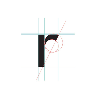 |
| Fig 2.3 Dissection of the letter "r". |
Font Design Brainstorm Sketching
After the letter study, we continue to start the font design by quick sketching the initial idea of the font design on the paper. Mr Vinod said that the font design can be different from the typeface we choose for dissection, what we have to concern about was how do we apply the knowledge we gained from the letter dissection into the process of font design. We must avoid fancy and decorative font design as we are designing for formal and serious reading purposes, a subtle and simple design will be appreciated. I have come out with 5 clean and minimalist font designs, playing around with a little round "serif", round edges and some interesting cuttings on some specific parts of the fonts.
 |
| Fig 2.4 The font design sketches. |
 |
| Fig 2.5 Final font design sketches. |
16/10/19 (Week 8)
Font Digitising in AI
During this week, we start our font digitising in adobe AI. (Fig 2.6) First thing first, We had to create a canvas or artboard size following the dimension of 1000pt (Height) x 11000pt (Width) by using the unit in point size as it was the standard unit to be used for lettering especially font design.  |
| Fig 2.6 Create a new file with the artboard dimension of 1000pt (Height) x 11000pt (Width). |
(Fig 2.7) After finishing creating the canvas, I proceed to create a grid line by using the ruler tool in AI. I created a simple "ruler" which was created by using simple shapes to ensure that each measuring process was convenient and time-saving. The middle space for 500pt was the dimension of x-height. The upper and the lower space of 250pt was created separately for the ascender and the descender. The width of 1000pt was set as the cut-off rule for each font.
 |
| Fig 2.7 Set the grid lines for the artboard. |
 |
| Fig 2.8 The first font design of the letter "d". |
(Fig 2.9) Below is the first stage of the font design in AI which comes out with two sets of font design that introduces the slight differences in the width of the letter "h" and "n". The loop of the letter "g", the spine of the letter "s" and the final of the letter "e" are slightly adjusted by tilting it to get the point of visual balance. There is also some adjustment on the leg of the letter "k", shoulder of letter "r" and also the title of the letter "i".
The terminal is introduced to the letter "t" in the second set of design, Mr Vinod mentioned that I shall avoid to making it too long as it will provide too much blank space in a words. Besides, I shall avoid making the stem of the letter "t" too high as normally it should be shorter than the stem of the letter "h", "k" and so on.
 |
| Fig 2.9 The first 2 set font digitising in the first design stage. |
(Fig 2.10) For the second design stage, shorter and smaller terminal for the letter "t" was created. Besides, there was also a smaller leg for the letter "k" and the smaller shoulder for the letter "r" comparing to the first stage design.
 |
| Fig 2.10 The second 2 set font digitising in the second design stage. |
(Fig 2.11 & Fig 2.12) Below were the reference images from the internet as a reference which helped me to get some inspiration to further design the letter "s".
 |
| Fig 2.11 Reference 1. |
 |
| Fig 2.12 Reference 2. |
(Fig 2.13) The rounder letter "s" design was introduced too to ensure the shape of each and every font was consistent and matching with each other. The first design of the letter "s" was a bit edgy and weird. Thus, I created a cut at the lower middle of the spine of the letter "S" to maintain the character and the trait of the font design. the rounder and smoother lines were applied to get the final font design result.
 |
| Fig 2.13 The development process of designing the letter "s". |
(Fig 2.14) After finalising the font design, I cleaned up and separated the layers in the AI file according to each font. Soon, I started to generate the outline for all of the fonts as a preparation work before I import the files into the FontLab Studio. (Fig 2.15) After generating the outline, I had to ensure that the outline of each font was well jointed connected.
 |
| Fig 2.14 The outline created for the font: Object > path > create outline. |
 |
| Fig 2.15 The outline combination for the font: Pathfinder > merge shape. |
23/10/19 (Week 9)
Key In Font in FontLabStudio 5
 |
| Fig 2.16 The key dimensions settings. We have to measure the ascender and descender in AI to key in the value in FontLabStudio. |
 |
| Fig 2.17 Key in the font into the "keyboard cell". |
 |
| Fig 2.18 Adjust the location of the font base on the x-height. |
(Fig 2.19) I opened the new metric window to do the letter kerning just to ensure the spaces between the letters look equal. Mr Vinod said that we should set the value of zero for the left side space for each font. The value for the right side space for each font should be maintained approximately around 50 to 100.
 |
| Fig 2.19 Font kerning in the metric window. |
 |
| Fig 2.20 Sentence generation in the metric window. |
 |
| Fig 2.21 Font generation: Files > Generate Font (Ctrl + Alt + G). |
 |
| Fig 2.22 Save Font: Save as type > True Type/Open Type TT (*.ttf). |
 | |
|
Fig 2.24 The PDF of the font design final outcome.
FEEDBACK
19/10/19 (Week 7)
Specific feedback: Mr Shamsul reminded me that I should include the week 4 lecturer in Project 1 for the typography blog. Besides, I had to be careful of the spacing paragraph in the blog to ensure that all of the paragraphs looked even.
General feedback: Mr Vinod reminded us that we should embed all specific feedback from any media like facebook or google feedback sheet to our blog. For the blog, the Jpeg file is needed to show the process of work, only the final design work needs both Jpeg and Pdf files embedded. Some simple briefs need to be added in the caption labelling part to show the exploration of ideas for the document (jpeg/pdf). When designing the typeface, we need to avoid an over-expressive and decorative style to come out with a font design with good readability.
Specific feedback: To my surprise, Mr Shamsul mentioned that my font design was nice especially the letter "d". Mr Vinod said that the shape design of the lettern "s" must be consistent with the circular shape of the letter "o" and "d". On the other hand, the terminal of the letter "t" was too long which might end up leaving too much empty space in a sentence. The ascender of the letter "t" must be shorter than the ascender of the letters k & h.
General feedback: Lecturers said that the font design style must be consistent and elegant rather than just looking good. Mr Vinod reminded us that we should continuously update our blog weekly but not wait until the end of the project as we must show the progress and the process of our project.
23/10/19 (Week 9)
Specific feedback: I was very surprised when Mr Shamsul and Mr Vinod mentioned that my overall font-kerning job was nice. They said the kerning space looked balanced and just right. The final kerning job was well done and the next thing to do was to export the font and install it. After installing the font, I need to create an A4 file and type in the sentence "God is in the kerning" and do some design by creating some paragraph spacing will do.
General feedback: Mr Vinod mentioned to the class that after we have done the font-kerning in FontLab Studio, installing the font, We need to create an A4 file and type in the sentence "God is in the kerning" and do some design by creating some paragraph spacing will do. We should not change the point size during the design process. Then, we needed to add a label of "(font name) by (our name): 2019 " at the bottom of the A4 paper.
30/10/19 (Week 10)
Specific feedback: Mr Vinod said that I shall try more alignment design for the sentence arrangement as basically everyone is doing the same sentence alignment. The lecturer said that I shall try as much interesting composition design for the sentence as long as the point size maintains the same.
General feedback: Mr Vinod reminded the whole class that we should try more different and interesting composition arrangement for the sentence paragraph rather than just copying and following the other friend design. We should arrange the composition base on our font design. The label font should be Helvetica/ariel in the point size of 7pt.
REFLECTION
Experience:
Week 7; Students were enjoying the process of dissecting the typeface in the class. The way Mr Vinod deliver lecture was much better than the previous presentation as the speed is just right. I was very happy that I was able to digest 80% of the lecturer presented by Mr Vinod o(>V<)o. Week 8; I really enjoy myself in the process of font design in the class. It was very amazing that everyone can be their own designer who can create a customised design for themselves! Lecturers gave me a useful opinion on my letter design which helps me did a better alter. Week 9; I was very happy and satisfied with my font design in the class, everything went well during the design process. I felt grateful that I was able to finish my font design and kerning on time.
Observation:
Week 7; We felt a little lost to come out with at least 3 ideas for the font design in one and a half hours. They were some students lost their direction in the process, by doing some research before we start the design process was one of the best ways to get ideas. I was happy that I was able to come out with several designs and consult them with the lecturer when the class was going to end! Week 8; In my observation, I could see the way how my classmates express and introduce their creativities and ideas in fonts design was indeed interesting and amazing. Each of the font design delivered a different story and characteristic of the designer's personality. Week 9; It was a lovely and warmth scene in the class that students in the class were very keen and helpful to give a kind help for those who were facing some problem with the font design. Besides, I discovered that even though a slight difference in the font design could make a huge difference.
Findings:
Week 7; It was very interesting to dissect and chop up the font design aiming to understand the reason and the construction of the specific font design. It was very crucial to create a visual balance for the font design. I found that the difficulties to type something meaningful rather than nonsense in the blog in the past was because I was lack of full understanding of the lecturer and the information delivered by lecturers. Week 8; I found that I was not confident enough for my letter design at the beginning as I always think that I can do even better and better rather than just stay in my comfort zone. I realised that my font design was not that bad at all but I just lack confidence in what I had on my hand. Complex design was not equal to good design, it was important to consider the principle of forms follow functions. Week 9; I felt really excited in this week as we were having the last stage for our project 2 that is too finalise our font kerning and export the font file. This meant that we had successfully generated our personalised, one and only font design! FURTHER READING
The Layout Book
By Ambrose / Harris
Week 7 (9/10/19)By Ambrose / Harris
 |
| Fig 5.0 The book cover of "The Layout Book" |
What I had learned?
Chapter 4.11: Hierarchy
A hierarchy is a logical and visual way to express the relative importance of different text elements by providing a visual guide to their organization. A text hierarchy helps make a layout clear, unambiguous and easier to digest.
A hierarchy is a logical and visual way to express the relative importance of different text elements by providing a visual guide to their organization. A text hierarchy helps make a layout clear, unambiguous and easier to digest.
- Typographical hierarchy: it can be formed by using different type sizes with the larger, heavier-weight assuming more importance than smaller, lighter weights.
- Positional hierarchy: it established by the relative text positions within a layout. Text set towards the top of a page and perhaps surrounded with the white space will command more attention and dominate over than which is part of the main text body.
Chapter 4.15: Pace
It's often desirable for printed material to have a certain pace so that the reader can comfortably progress through it. If a publication becomes too tedious, a reader is likely to stop reading it. A layout can introduce breaks into the text to help maintain reader interest and provide pauses, which allow the reader to stop and reflect on the information they have received and anticipate what is to come.
EYE CANDY
David Ho Ming Aun
Week 8 (16/10/19)David Ho Ming Aun

What I had learned?
This book was all about the dissertation places focus on the responsible use of a typeface in a culinary experience, examing how a typeface can influence both taste expectation and preception through quantitative methods, such as series of interviews and controlled experiment.
There's a saying in the Chinese culture, that "you eat with your eyes first." The relevance of this world-of-mouth applies itself well in today's visual landscape of the culinary experience-through rows of packaging screaming products benefits from the shelves, the careful choices of colour in shops interiors, and even the meticulously hand-lettered menus in cafes.
An exploration of the link between taste perception, the roundness/angularity of a typeface, preference of a typeface, and legibility of a typeface was conducted through a couple of online experiments. The result shows that typefaces are perceived as being sweeter if it was more rounded, preferred, and legible, and conversely so for typefaces perceived as being more bitter. As insightful as the results were, it was worth noting that the participants did not physically taste any tastants, as the experiment was disseminated and conducted through an online form.
.jpg)


Comments
Post a Comment