💧 Project 1

Ng Mei Ying (0340563)
Typography
Project 1
LECTURER NOTES
Lecture 4: Working with Type
18/09/19 (Week 4) |
| Fig 1.0 Leading vs Line of Type vs Line Spacing |
- Pilcrow (¶): Symbol of paragraph spacing which is seldom used today.
- Leading: The space between 2 lines of text.
- Line of Type: The total height of the text.
- Line spacing: The total space of the leading & the line of type.
- Indentation: The spacing of the new starting sentence. (same size as point size)
 |
| Fig 1.1 Widow vs Orphan |
In traditional typesetting, there are two unpardonable gaffes — widows and orphans. Designers must always take great care to avoid the occurrence of the above mentioned.
- Widow: a short line of type left alone at the end of a column of text.
- Orphan: a short line of type left alone at the start of a new column.
The only solution to widows is to rebreak your line endings throughout your paragraph so that the last line of any paragraph is not noticeably short. For the Orphans, typographers need to ensure that no column of text starts with the last line of the preceding paragraph.
 |
| Fig 1.2 Example of paragraph highlighting by using different font. |
There are various type of ways to highlight a paragraph:
(Always maintaining the left reading axis of the text ensures readability is at its best)
- Change the font style
- Change the text color
- Use Itali Typeface
- Use Bold text
- Place a field of color at the back of the text
- Add bullet point
- Add quotation marks
 |
| Fig 1.3 Sample of 3 types of the headline. |
There are many kinds of subdivisions within the text of a chapter. In the following visuals, these have been labeled (A, B and C) according to the level of importance. A typographer's task is to make sure these heads clearly signify to the reader the relative importance within the text and to their relationship with each other.
Putting together a sequence of subheads = hierarchy.
- A headline: clear break between the topics within a section.
- B headline: subordinate/supporting to A heads.
- C headline: highlights specific facets of material within B head text.
 |
| Fig 1.4 Sample of Cross Alignments. |
Cross aligning headlines and captions with text type reinforces the architectural sense of the page—the structure—while articulating the complimentary vertical rhythms. In this example, four lines of caption type (leaded 9 pts.) cross-align with three lines of text type (leaded to 13.5pts).
" Typography is two-dimensional architecture, based on experience and imagination, and guided by rules and readability. "
— Hermann Zapf
Critique session
25/09/19 (Week 5)
There was no lecture for this week but our lecturers launched a critique session for our headline and layout design, feedback and comments were given to improve our design. Moreover, they told us they do and don't for our blog editing. Besides, Lecturer taught us some more skills for Adobe InDesign.
ADOBE INDESIGN:
- File > Adobe Pdf Preset > HQ print
- Turn on Spreadsheet to export 2 pages file
- Turn on Visible Guide & Grids to export files with the margin
- Double click master page
- Draw a text box to insert page number
- Cmd/Ctrl + Shift to edit page number
- Indentation with paragraph spacing is not suggested
- As there will be ragged at both sides of the text (not good for text readability)
- The indentation will only be accepted without adding paragraph space.
INSTRUCTIONS
Project 1: Headline & Body Text Application
18/09/19 (Week 4)
During this week, Mr Vinod introduced us to the new design software --- Adobe InDesign. InDesign is purely a page layout program, and it's also a vector-based program much the same as Illustrator. We had learned about basic tools and short cut keys in this software.
Moreover, we started our first project which was designing 2 pages of layout. We read through the editorial text given by the lecture and chose one of them to work on. We had to digest and understand the tone of the paragraph which is a literary work expresses the writer's attitude toward or feelings about the subject matter and audience before we start our design.
The following instructions to follow for Project 1:
- No images allowed
- Only black, grey & white in colour
- Do tracking manually
- Utilize the given 9 type family
- Size of page is 200 x 200mm (2 pages)
- Pick the suitable typeface base on the tone
The editorial text I choose was <The impact of Bauhaus in the modern culture>. The tone delivered by the paragraph was simple, direct yet influential. I did some research about Bauhaus. The Bauhaus—literally “school of building”—was a German avant-garde arts and crafts academy. More than the design itself, Bauhaus has been a historical milestone is art and architecture. The philosophy behind the “Bauhaus design” is as clean and straightforward, as has been its impact on the traditional or classical styles, redefining them in the modern layout.
Hence, I choose the typeface with the minimal serif to suit the tone of the text like Futura Std, Gill Sans Std, Universe LT Std and so on. I continued work on the font size, line length, leading, and so on. What most challenging was I had to choose the suitable point size to maintain the characters in the line length around 55-65, at the same time I need to avoid the widows, orphans and the river in the text manipulating process. The only solution to get rid of the problems was to do text tracking manually. For the headline design, I designed it base on the clean and straightforward nature and the concept that delivered by Bauhaus by showing the simple beauty of the font shape and lines.
 |
| Fig 2.0 Layout Design Version 1 |
 |
| Fig 2.1 Layout Design Version 2 |
 |
| Fig 2.2 Layout Design Version 3 |
 |
| Fig 2.3 Layout Design Version 4 |
 |
| Fig 2.4 Layout Design Version 5 |
After I got the feedback and suggestion from my lecturer, I started to modify the layout design. For the headline design, I choose one of the designs I had did (Fig 2.2) to do further development by adding more details. After confirming my headline design, I did a further adjustment for the body text layout design. I found that I couldn't align some of the sentences although I had set the value of alignment. I keep on adjusting the font size at the same time use enter and force enter to ensure that all sentences were aligned to each other.
 |
| Fig 2.5 Layout Design Version 6.1 |
 |
| Fig 2.6 Layout Design Version 6.2 |
 |
| Fig 2.7 Layout Design Version 6.3 |
During the critique session, Mr Vinod preferred the first headline design (Fig 2.0) as he said the design element was more interesting compared to the other design. He said that my body text is neat and nice but he wanted me to do more design adjustment for it. The first edit was to play with the angle of the body text. I rotated and tilted the body text in 45 degrees to ensure that the whole design was related to the headline design. However, Mr Vinod said that this body text design would be only suitable for vertical reading way like poster design. It was not suitable for the horizontal flipping reading experience.
 |
| Fig 2.8 Layout Design Version 7.1 |
Hence, I had created a second design by doing some adjustments from the design of (Fig 6.3). The overall space distribution was clean and even. Staircase style design had created a gradual layer of text box design which will lead the reading sight from down to up. The lecturer mentioned that this design was much more suitable for a horizontal flipping reading mode that had better readability.
 |
| Fig 2.9 Layout Design Version 7.2 |
Fig 2.10 PDF of Layout Design Version 7.2
FEEDBACK
25/09/19 (Week 5):
Mr Vinod said that my Headline design is well done and related to the tone of the text. He commented that I should work more for the tracking of the body text. The indentation was not preferable for the flush left alignment with paragraph spacing as there will be ragged at both sides of the text which was not good for text readability. (Intention for flush left alignment will only be accepted without adding paragraph space.) Moreover, I should use the margin lines that I created to do the layout design.
02/10/19 (Week 6):
Mr Vinod said that the body text layout design was nice and clean but for the headline design, he thought that the first version of the headline design was the best among all of the design. He preferred that I could do some adjustments based on the headline design to ensure that both the design of the headline and the body text were related and connected.
REFLECTION
Experience:
Week 5; It was quite challenging to deal with the layout design when it came to limited body text given. At the beginning when I designed the layout of the body text, I thought it will be much easier to deal with less about of text but I found that I was totally wrong as I had to pay more effort and research to play with the layout design and do a nice tracking of text with a limited amount of text. If I did not do so, I would found that there was to much negative space for the whole layout. Rivers, orphans, and widows in the body text were my biggest challenges to deal with. Week 6; I was a little sad that the first headline design was better than the other headline design which I had spent a lot of time to come out with the design. It was quite stressed at the beginning as we had to finish the final design in this class. I felt happy that Mr Vinod had approved my design when I showed it to him with the A3 printing hardcopy.
Observation:
Week 5; I observed that there were any ways to convey the tone of the text. They could be simple or complicated. I tried to avoid myself to create an overcomplicated or messy layout and is struggling too much to fill up all the black space in their layout design as your artwork would only be appreciated when there was sufficient negative/white space given. Negative space was not our enemy but it was an important factor to provide a comfortable visual experience for the viewer. By applying sufficient negative space will let our design "breathe" and being appreciated. Week 6; When the lecturers were checking the students' layout design one by one, everyone in the class tried their best to utilize the waiting time to come out with the best layout design and print it on A3 paper.
Findings:
Week 5; I found that it was really crucial to do sufficient research before you straight ahead indulging yourself to start the design as to ensure that you could come out with a well-grounded and convincing design. Also, read as much as we can because reading will not only improve our writing skills, it would also help us to build up our professional knowledge which will transform into a good presentation ability too. Week 6; I found that it was very important to do more research before we start the design to ensure that the design outcome is relatable and convincible. Always remember that "Less speak louder than more".
FURTHER READING
Stop Stealing Sheep & find out how type works (Third Edition)
By Erik Spiekermann
Week 5 (25/09/19)By Erik Spiekermann
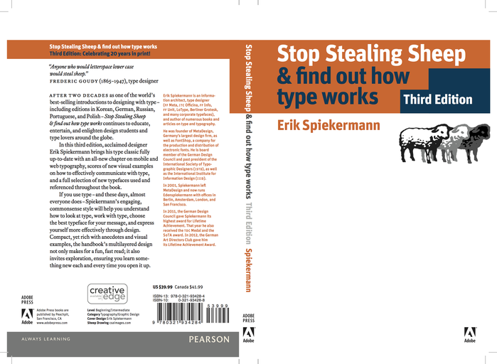 |
| Fig 5.0 The Book Cover |
What I had learned?
The basic shapes of the letter haven't changed much in hundreds of years. The typeface for reading is generally derived from handwriting. Over the centuries, cultural differences have been manifested in the way people write. People began to care more about expressing their thoughts quickly, and less about style and legibility. The common denominator, the Roman alphabet, has survived all these developments remarkably intact.
- Strike a balance between practicality and aesthetics when choosing a font.
- Brands have to speak their own authentic language by using type.
- Different types have a different characteristic which builds character.
- Letters were originally invented to help communicate not high culture.
What is Typography?
By David Jury
02/10/19 (Week 6): |
| Fig 5.1 The Book Cover |
What I had learned? (Part 1)
If we were to consider the normal, everyday activities that consume our lives, it would quickly become apparent that typography is ubiquitous and inescapable. This material is routine and boring but it also very essential. Typography has been traditionally associated with the design and printing industry. However, owing to the universal access to digital technology, the word "Typography" is increasingly used to refer to the arrangement of any written material and is certainly no longer restricted to the work of typographers.
Typography and writing have always been closely entwined: Typography being the discipline and professional practise that mediates between the content of the message and the receiving readership. Therefore, to understand the grammar of typography, one must also gain a knowledge and understanding of language and how it is adapted to function in various social contexts.
.jpg)


Comments
Post a Comment