💧 Project 1
Advanced Typography
Project 1
LECTURE NOTES
12/05/20 (W5): Designing Type
Today we were having group 2 for the presentation sharing. The sharing was mainly surrounded by the topic of the designing type, some design approaches as well as the core design thinking.
Designing Type:
- Anatomy of type
- General process of designing type
- How to think before drawing
- Construction of component
- Characteristic of good type design
- Designers design process and approaches
INSTRUCTION
Project 1: Key Artwork
12/05/20 (W5)
For this project, the student needs to creatively and conceptually use visual and type in combination to create a key artwork to be used in the collateral design for example T-shirt, sticker, Badge and so on. The focus here is to use visual elements, and or graphical elements and the title (type) in an experimentive, impactful and visually attractive manner. The use of imagery must be of similar importance with the title in terms of visual hierarchy. The information reflected was the crucial point instead of what it looked like.
Project 1:
- Choose one topic from Typographic Systems (Exercises)
- Create a key artwork for collateral
- Any typeface & colour are allowed
Idea vs Concept
- Idea: The trunk of the tree.
- Concept: The bunches of the tree.
- "The better the ideas, the more the concepts. A good idea has good legs" --- Mr Vinod.
About Punk Design: https://99designs.com/blog/
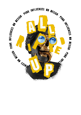
"Typesetters, aside from being expensive in a poor economy, also situated text on a rigid grid. In order to get around these limitations and restrictions, punk imagery took to a variety of methods to showcase their simple, dirty and aggressive messages. This collage style suggested a ripping up and starting again. The style takes a commercial image and repurposes it for revolutionary purposes. With punk’s general disdain for all things conventional the freedom this hand created format allowed punk style to break out of the typographic grid that was limiting to most designers at the time when the text was regularly formatted in this standardized method."
 |
| Fig 1.0 Material Image 1 |
 |
| Fig 1.1 Material Image 2 |
 |
| Fig 1.2 Idea Sketching according to the image found. |
 |
| Fig 1.3 Crop the image |
 |
| Fig 1.4 Arrange the title text with a suitable font is chosen |
 |
| Fig 1.5 Insert the subtitle in the dilatational system. |
 |
| Fig 1.6 Typesetting text style is chosen for the content. |
 |
| Fig 1.7 Paper torn shape added as a background. |
 |
| Fig 1.8 Ink splash effect & sketchy doodling applied. |
 |
| Fig 1 .9 The collage of the statue image added. |
19/05/20 (W6)
Key Artwork Design Attempt 2:
According to the feedback given by Mr Vinod, I needed to redo my key artwork design as I was designing in the wrong direction. I should design something like a logo but not a poster design. I came out with the new design with the elements of sketchiness as well as the paper tearing remained. Mr Vinod told me to continue exploring the design, the form of design was not there yet.
 |
| Fig 2.0 Key Artwork Design Attempt 2. |
26/05/20 (W7)
Key Artwork Design Attempt 3:
After consulting Mr Vinod, he prefered the design 1 and 3. The next thing I needed to figure out how to arrange the subtext "Punk Influence In Design" to interplay with the key artwork. Make sure the subtext was expressive enough to deliver the punk elements.
 |
| Fig 2.1 Key Artwork Design Attempt 3. |
02/06/20 (W8)
Key Artwork Design Attempt 4:
Idea manifested here was the paper torn element interplay with the key artwork and the subtext.
 |
| Fig 2.2 Key Artwork Design Attempt 4. |
Key Artwork Design Attempt 5:
Idea manifested here was the "spraying effect" interplay with the key artwork and the subtext.
 |
| Fig 2.3 Key Artwork Design Attempt 5. |
Key Artwork Design Attempt 6:
The main idea manifest here was the "spraying effect" interplay with the key artwork and the subtext. Mr Vinod liked the smart idea of using the "spraying effect" to interpret the design of Punk. The first design I had come out were 1 and 2 only, he preferred the design of no.2 and advised to introduce another edge at the bottom area to create visual balance. Hence, I came out with design 3, 4, 5 and 6 after the lunch break. Mr Vinod mentioned the new design was nice but he won't be giving any comment on it as I needed to decided my design critically on my own.
 |
| Fig 2.4 Key Artwork Design Attempt 6. |
 | |
|
 | |
|
 | |
|
 | |
|
 | |
|
| Fig 2.10 Final Key Artwork Design Pdf |
FEEDBACK
12/05/20 (W5)
- Specific feedback: Student needs to ensure that the blog was completely done. Besides that, students can have the blog as the resource for further reading but not only limited to books.
- General feedback: The overall refinement for the final poster design was great. It's good to look at personal work in a third party shoe so one's could observe it more critically. The suggestion was given on the shadow performing, it could be improved at a higher level by adjusting the fuzziness of shadow according to the source of light.
19/05/20 (W6)
- Specific feedback: Students were advised to read all of the example posted on Facebook and found out how the key artwork elements work well. Students are advised to start with a simple key element without colour to have a clearer overview on the arrangement on the text, only add on some graphic and change some colours after the font is well arranged.
- General feedback: The design element seemed to work well but it's a total poster design, not a key artwork. More focus needed to apply on one of the key elements in the poster especially the pencil scribbles with the punk texts of letter R, E & D is quite interesting, the advice is given to start on the arrangments in greyscale colour.
26/05/20 (W7)
- Specific feedback: Refer to more reference given by Lecturer.
- General feedback: The basic form of the key artwork was acceptable, the next thing to do was to include the single line "Punk Influence On Design" that interact well with the key artwork (could be in an expressive manner.)
02/06/20 (W8)
- Specific feedback: Refer to more reference given by Lecturer and study it critically. Especially Mr Vinod's most preferable designer's artwork, worth studying. Utilise the typographic system we had learnt and applied it into the poster design. Everyone should be more critical to be able to criticise one's own work in this advanced level without relying too much on lecturer's feedback.
- General feedback: The design of key artwork was better than the previous version. The introduction of a new method using "spraying" effect was quite smart however the subtext was too expressive. Ensure the use of negative space to ensure a balanced visual effect.
REFLECTION
12/05/20 (W5)
- Experience: Time management for the lecture and consultation was much more efficient than the previous time.
- Observation: I obviously observed that the works of my peers had a better improvement after the guidance by lectures.
- Findings: My findings for this week was I could learn a lot by looking into others works critically during the consultation session. Critical thinking was a great practice to improve one's work with self-conscious.
19/05/20 (W6)
- Experience: The consultation session for this week was in the way more efficient and effective compared with the previous session that helped us save time to work on the amendment.
- Observation: I realised that I was facing the same problem as the other students, generally were having the misunderstood on the characteristics as well as the key elements of key artwork design.
- Findings: I had a better understanding of the characteristics as well as the key elements to creating key artwork related to punk design.
19/05/20 (W7)
- Hari Raya Holiday 🍀
02/06/20 (W8)
- Experience: Key artwork design was very challenging for me as I was thinking to make the design simpler but it might lead to a design that was lack of interesting elements.
- Observation: There were many students facing their challenge to came out with a great design.
- Findings: I found that I should explore more possibilities in my key artwork design.
FURTHER READING
Book Name: The Vignelli Canon
By: Massimo Vignelli
About the book:
The book is divided into two parts: The Intangibles and The Tangibles. The first looks at the theory and intellectual underpinning of design in the broadest sense but also, nicely I thought, how it relates to print. In just thirty-six pages Vignelli manages to sum up some broad concepts that others take a whole book to reveal. Part two: The Tangibles is a much more practical look at the nuts and bolts of print design. There are some very sensible points made here, especially about typography. Like most professional designers who have been working for decades a limited selection of faces is all that is needed.


Comments
Post a Comment