💧 Project 2
02/06/20 - 16/06/20 (Week 8 - Week 10)
NG MEI YING (0340563)Advanced Typography
Project 2
INSTRUCTION
Project 2: Collateral
02/06/20 (W8)
For this project, the student needs to come out with a poster design with the key artwork applied. The poster design was the most important phase to establish the design for the other merchandise. Hence students had to ensure that the design of the poster worked fine.
Project 2:
- Choose one topic from Typographic Systems (Exercises)
- Poster (Static 50 x 70cm), Invite (interactive), T-Shirt, Sticker, Pin Badge, Tote Bag, etc.
- Any typeface & colour are allowed
 |
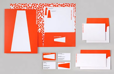
| Fig 1.0 Key Artwork Reference 1 |
 |
| Fig 1.1 Collateral Reference 1 |
 |
| Fig 1.2 Key Artwork Reference 2 |
 |
| Fig 1.3 Collateral Reference 2 |
Collateral Poster Design Attempt 1:
 |
| Fig 1.4 Poster Design (Version 1) |
 |
| Fig 1.5 Poster Design (Version 2) |
 |
| Fig 1.6 Poster Design (Version 3) |
Collateral Poster Design Attempt 2:
 |
| Fig 1.7 Poster Design (Version 4) |
 |
| Fig 1.8 Poster Design (Version 5) |
 |
| Fig 1.9 Poster Design (Version 6) |
09/06/20 (W9)
Below was the design of the new posters after the consultation with lecturers. The key artwork should stand out from the rest of the elements, the sub-text must act as an enhancement for the key artwork. Students should start the invites and other 2 items design done by this week.
 |
| Fig 2.1 Poster Design (Version 7) |
 |
| Fig 2.2 Poster Design (Version 8) |
 |
| Fig 2.3 Poster Design (Version 9) |
 |
| Fig 2.4 Poster Design (Version 10) |
 |
| Fig 2.5 Poster Design (Version 11) |
 |
| Fig 2.6 Poster Design (Final version) |
Fig 2.7 Poster Design (Final version Pdf)
Collateral Invites Design:
 |
| Fig 2.8 Invites Gif Design (version 1) |
 |
| Fig 2.9 Invites Gif Design (Final version) |
16/06/20 (W10)
In this week, students should finish the collateral design and start to prepare for the final design project due to the interest of time. Students should work in a way of high efficiency and smartly. The other collateral items I had chosen was the T-shirt, tote bag as well as the sport cap.
Collateral Sport Cap Design:
 |
| Fig 3.0 Sport Cap Design (version 1) |
 |
| Fig 3.1 Sport Cap Design (version 2) |
 |
| Fig 3.2 Sport Cap Design (version 3) |
 |
| Fig 3.3 Sport Cap Design (version 4) |
Collateral Tote Bag Design:
 |
| Fig 3.4 Tote Bag Design (version 1) |
 |
| Fig 3.5 Tote Bag Design (version 2) |
 |
| Fig 3.6 Tote Bag Design (version 3) |
 |
| Fig 3.7 Tote Bag Design (Final version) |
Fig 3.8 Tote Bag Design (Final version Pdf)
 |
| Fig 3.9 T-shirt Design (version 1) |
 |
| Fig 3.10 T-shirt Design (version 2) |
 |
| Fig 3.11 T-shirt Design (version 3) |
 |
| Fig 3.12 T-shirt Design (final version) |
Fig 3.13 T-shirt Design (Final version Pdf)
All Final Collateral Design:
 |
| Fig 4.2 Invite Design (Final Version GIF) |
 |
| Fig 4.3 Tote Bag Design (Final Version JPG) |
 |
| Fig 4.4 T-shirt Design (Final Version JPG) |
 |
| Fig 4.5 Flat Lay of Collateral Design (Final Version JPG) |
Fig 4.6 Collateral Design Compilation (Final Version Pdf)
FEEDBACK
02/06/20 (W8)
- Specific feedback: Refer to more reference given by Lecturer and study it critically. Especially Mr Vinod's most preferable designer's artwork, worth studying. Utilise the typographic system we had learnt and applied it into the poster design. Everyone should be more critical to be able to criticise one's own work in this advanced level without relying too much on lecturer's feedback.
- General feedback: The design of key artwork was better than the previous version. The introduction of a new method using "spraying" effect was quite smart however the subtext was too expressive. Ensure the use of negative space to ensure a balanced visual effect.
09/06/20 (W9)
- Specific feedback: The key artwork should be the most outstanding element in the poster. The subtext should act as sub-elements that enhance the key artwork. The poster design looked nice but still a lot more to improve as it was over-designed. I should start everything from simple.
- General feedback: Students should establish all the design well in the poster as it was the base thing to confirm the design for the other item design. Key Artwork should not be frequently changed as it was the prominent element to establish the identity of the design.
16/06/20 (W10)
- Specific feedback: The animation effect for the key artwork was a great job but try to avoid the cascading arrangement and motion effect for the content of invitation, the suggestion was given to make it drop from the top to the bottom with gravity applied. The design for the other collateral was not on the point yet, the suggestion was given to pick the element of some text and rearrange a new graphic pattern. Avoid being too deliberate in dismantling the key artwork to avoid the obvious visual repetitions on the existing key artwork design.
- General feedback: The final project was about to solve the typographic problem towards the existing item. The exploration could be related to your future specialisation. Students should try their very best to launch the final project with full effort in a limited duration.
REFLECTION
02/06/20 (W8)
- Experience: Key artwork design was very challenging for me as I was thinking to make the design simpler but it might lead to a design that was lack of interesting elements.
- Observation: There were many students facing their challenge to came out with a great design.
- Findings: I found that I should explore more possibilities in my key artwork design.
09/06/20 (W9)
- Experience: Student needed to keep coming out the new designs in the limited time to get approvement from the lecturers.
- Observation: Lecturers were very patient to guide students in their poster design although many of our design looked like a disaster.
- Findings: I felt quite frustrated as I could not get lecturers' resonation on my poster design although I was quite satisfied with some of the design layout and approaches.
16/06/20 (W10)
- Experience: It was always lack of real sense when it came to the online course, the audio quality problem had brought too much inconvenience for lecturer and students both tangible and intangible. Lecturers seemed to be tired of the internet problems as well as the shortage of time for students' assignments. Lecturers were guiding the student with good care as well.
- Observation: The number of students was decreasing obviously comparing with the first few weeks, seemed like the virtual learning environment together with the heavy workload of assignments was the biggest challenge to overcome for many of the young designers.
- Findings: I felt that my brain was lack of idea and solution comparing to the past for the static graphic problems under high pressure and tiredness. It might be a terrible sign of brain degeneration due to the lack of proper rest and appropriate tasks delegation. I found that Mr Vinod had such an extreme taste in design that I couldn't figure out the mystery 😶 It still a long journey for me to improve my sense of design.
FURTHER READING
Book Name: Thinking With Type
By: Ellen Lupton
About the book:
This book is assembled in three sections: Letter, Text, and Grid, building from the basic atom of the letterform to the 'organisation of words onto coherent bodies and flexible systems. Each section opens with a narrative essay about the cultural and theoretical issues that fuel typographic design across a range of media. The demonstration pages that follow each essay show not just how typography is structured, but why, asserting the functional and cultural basis for design habits and conventions. This book allowed me to have a better grasp of the typographic system that would greatly benefit my design thinking for the current project.


.jpg)
Comments
Post a Comment