💧 Final Compilation & Reflection

30/10/19 - 27/11/19 (Week 10 - Week 14)
Ng Mei Ying (0340563)
Ng Mei Ying (0340563)
Typography
Final Compilation & Reflection
SUBMISSIONS
EXERCISE:
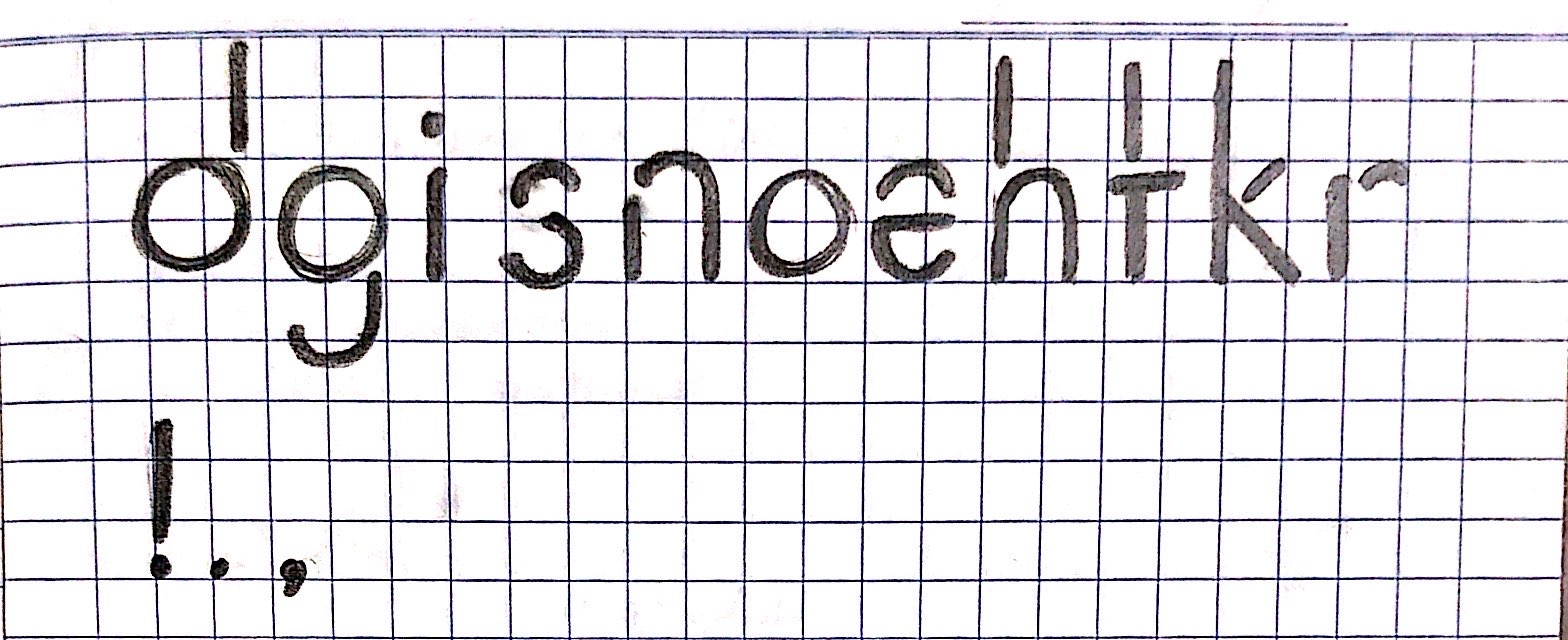
PART 1 : LETTERING
PART 1 : LETTERING
 |
| Fig 1.0 Final Outcome of Lettering JPG (Artistic) |
Fig 1.1 Final Outcome of Digitized Lettering PDF (Artistic)
 |
| Fig 1.2 Final Outcome of Lettering GIF Animation (Artistic) |
PART 2: TYPE EXPRESSIONS
 |
| Fig 2.1 Final Outcome of Type Expression (JPG) |
Fig 2.2 Final Outcome of Type Expression (PDF)
 |
| Fig 2.3 Final Outcome of Type Expression "Emerge" (GIF) |
PROJECT 1: Text Formatting & Layout Design
 |
| Fig 3.0 Final Outcome of Layout Design (JPG) |
Fig 3.1 Final Outcome of Layout Design (PDF)
PROJECT 2: Font Design
 |
| Fig 4.0 Final Outcome of Font Design Sketch. |
 |
| Fig 4.1 Final Outcome of Font Design (JPG) |
 | |
|
Fig 4.3 Font Design Layout of Cirene Regular (PDF)
 |
| Fig 4.4 Font Information of Cirene Regular in FontLab Studio. |
| Fig 4.5 Font Information of Cirene Regular in PDF. |
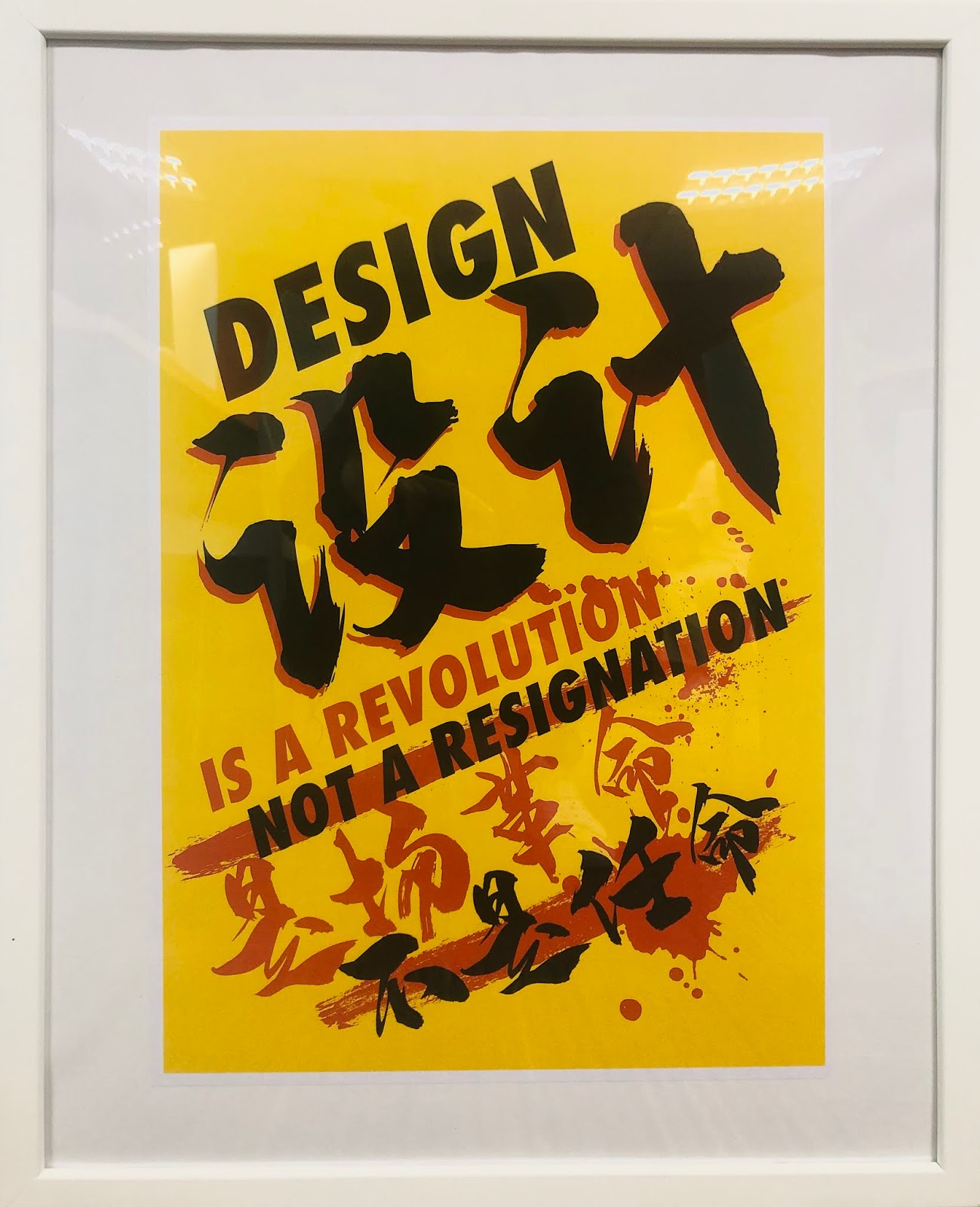
FINAL PROJECT: Manifesto Protest Poster Design
 |
| Fig 5.0 Final Outcome of Manifesto Placard Design. (JPG) |
 |
| Fig 5.1 Final Outcome of Manifesto Poster Design. (JPG) |
Fig 5.2 Final Outcome of Manifesto Poster Design. (PDF)
 |
| Fig 5.3 Final Outcome of Manifesto Poster Design. (GIF) |
 |
| Fig 5.4 Final Outcome of Manifesto Poster Design. (Photo Frame) |
REFLECTION
Experience
Before the class started, some of the seniors told me that this module would be quite challenging for the new students as the lecturers wanted students to play the fullest in their assignments. I was very excited as this module was quite interesting for me but yet I was quite worried about the work pressure. I literally thought that we would learn some interesting traditional printing and quill writing techniques. During the real class, it came out with different things, our first exercise was very interesting which was to design our name according to our personality. During the first class, everything was very new to me and I found that it was quite challenging to catch up with all of the mass information for the first class because of the fast pace teaching speed and strange professional vocabulary. However, things get better gradually when I had mastered more knowledge about the specific software and typography as I found that I was able to catch up on the assignment although there was a time-constrained. I very appreciated that lecturers were very keen and friendly to help with my problem to ensure I was able to completely overcome all of the problems.
Observation
By recalling the memories for this module, I thought that typography would be something same like the fundamental knowledge about graphic design and design principle, but I found that sometimes they were not absolutely same with typography. People tend to pick a font just merely depends on its aesthetic visual design as a strong reason to use the font. However, I found that the way I digest and look a the typeface around me had changed gradually after I gain some fundamental knowledge about the typography. I understand that as a designer, we had to have a deeper consideration and thinking rather than just create something nice but meaningless and functionless. I will tend to analyse and dissect the font that I saw like the typeface used, kenning, alignment, layout composition, readability and so on. The most common mistake young designers made as they always tend to add on all of the elements in the design to create a visual plentiful illusion but it always end up as a messy yet pointless design. These were all the precious treasure I had the gain of this class that would bring a great benefit for my future design path.
Findings
This course was just like a gift rather than just a challenging. At the beginning of the class, I found it was very challenging for me to keep track on the process of my every exercise by writing a blog as I did not have any experience in writing a blog for my assignment. I had ensured that my blog was clean and easy to read rather than just writing useless information to make it seem too bulky. Time management and self-discipline were crucial for this class to ensure that I could complete everything on time. For the first time, I started my blogger, it was quite frustrated to maintain the blog as it was actually taking up the triple of the time of doing the project just for the blog. Sometimes I assumed that if we could manage to create a good blog in a good time manner, it would possible for us to build the ability to publish a book too... Besides, I found that typography had strengthened my self-learning ability rather than just escape from the problems. For instance, I had to pick up new software for my typography exercise although I had not been taught how to use the software in the other module. I had to search for the extra solution for my problem that I faced in the exercise initiative as sometimes lecturers could not take care of all of the students in one class with limited lesson time available. Taking note and reading had played a big role to ensure that I could totally understand what I had learnt for each of the lessons. At the same time, I also learnt how to read fast with limited time by just read through the specific chapter which was important to me.
.jpg)


Comments
Post a Comment